BOOKS
Circular 22 Editorial Design by Pentagram: A Playful Reinvention of Typography
08 Jan 2025
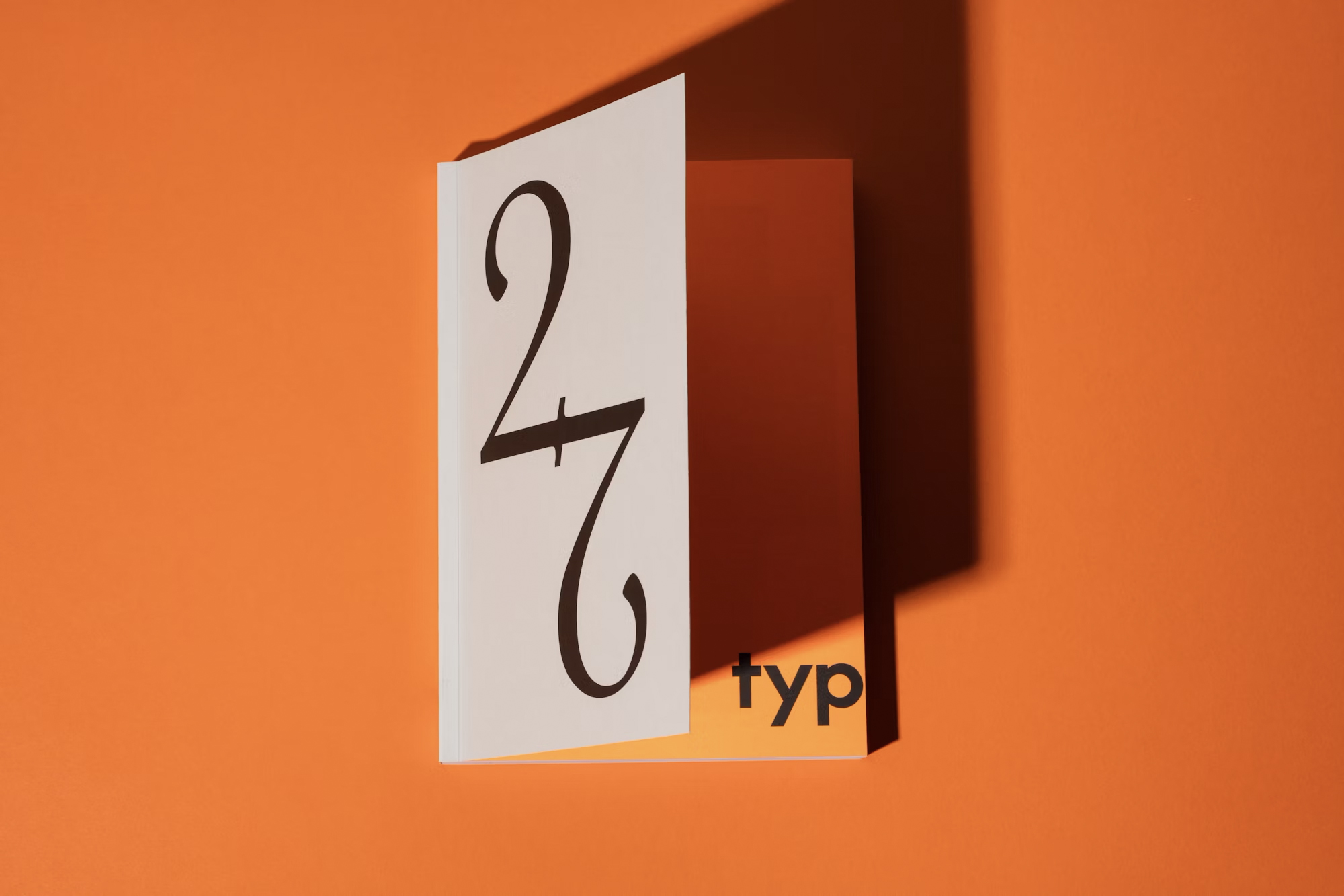
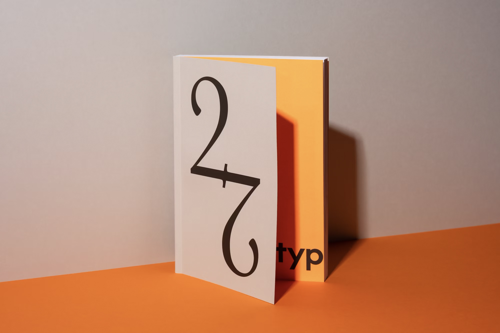
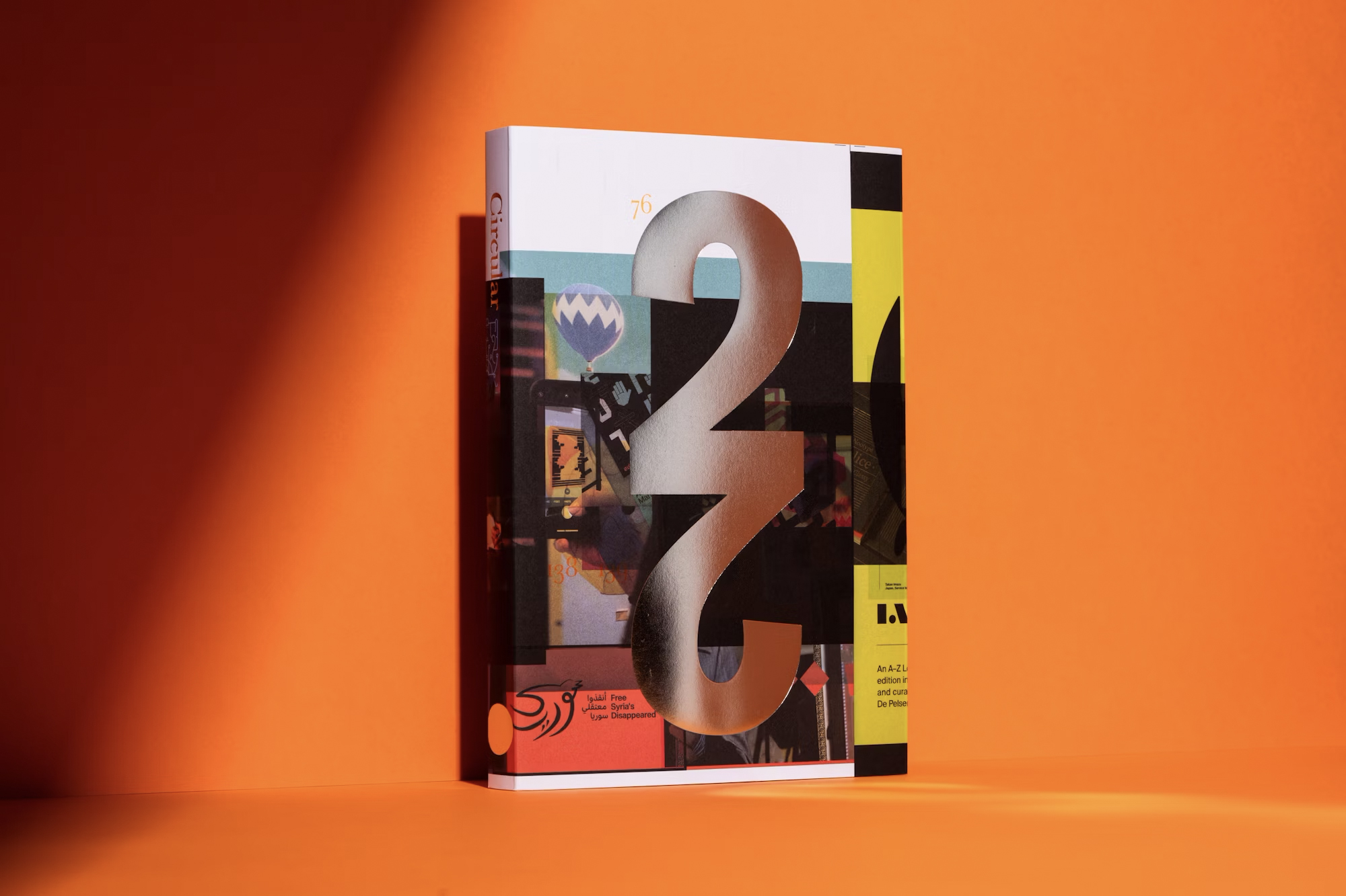
Pentagram's design for Circular 22, the latest publication from the Typographic Circle, embraces the spirit of creativity and experimentation with a playful, bold redesign. Circular, the magazine for members of the Typographic Circle, a social organization for typography enthusiasts, began in 1993 as a platform for news, events, and information. Over the years, it has been shaped by various designers, with the latest issue—Circular 22—marked by an innovative approach that blends brutalism and pop-art, elevating the traditional design process to new heights.
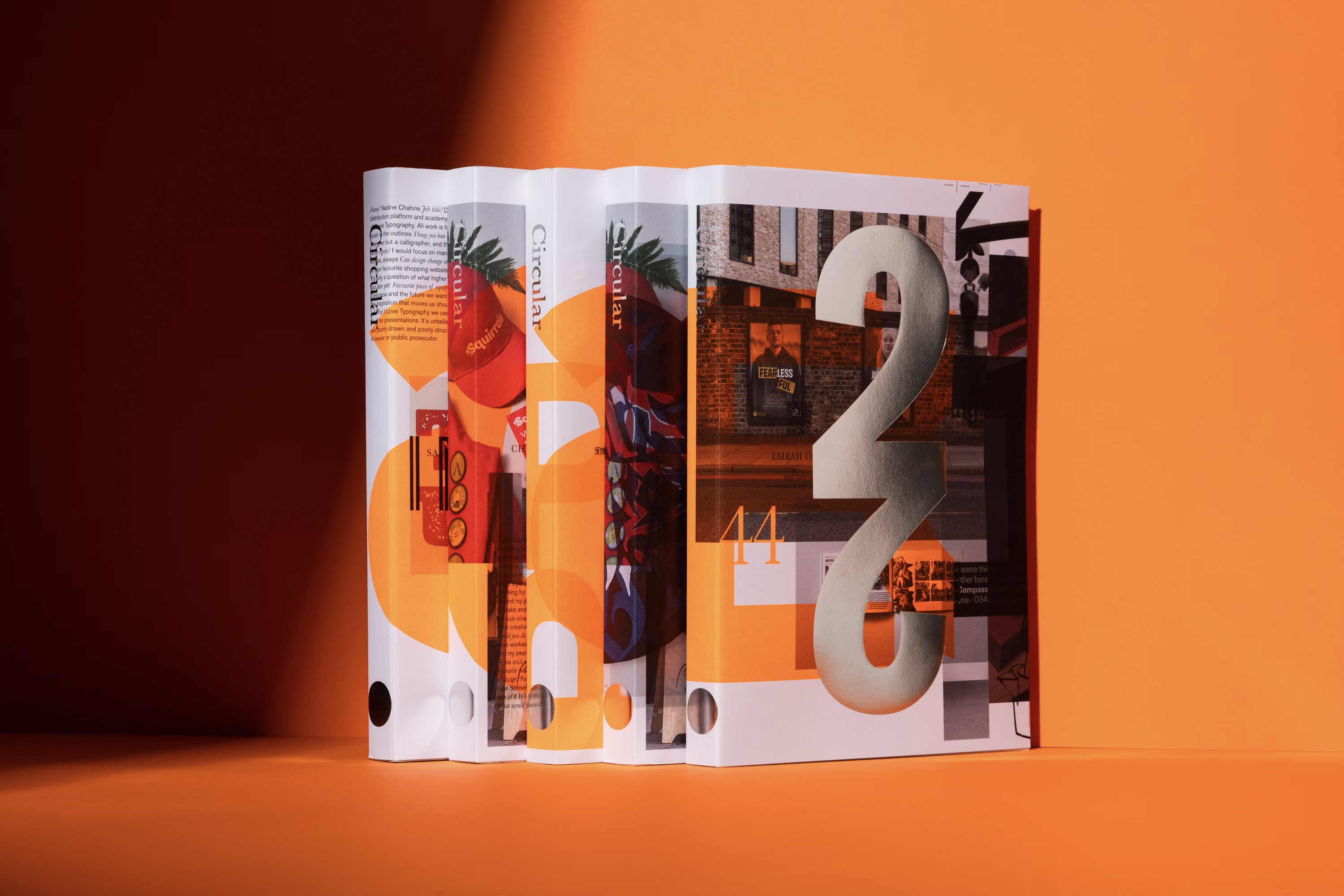
The editorial direction for Circular 22 was a collaboration between Domenic Lippa, longtime editor and art director, and Jim Sutherland, Vice-Chair of the Typographic Circle. The redesign was inspired by a desire to offer readers a more portable magazine for their commutes, reflecting a modern need for accessibility. This led to the decision to downsize the magazine to a half-size format while increasing its production quality.
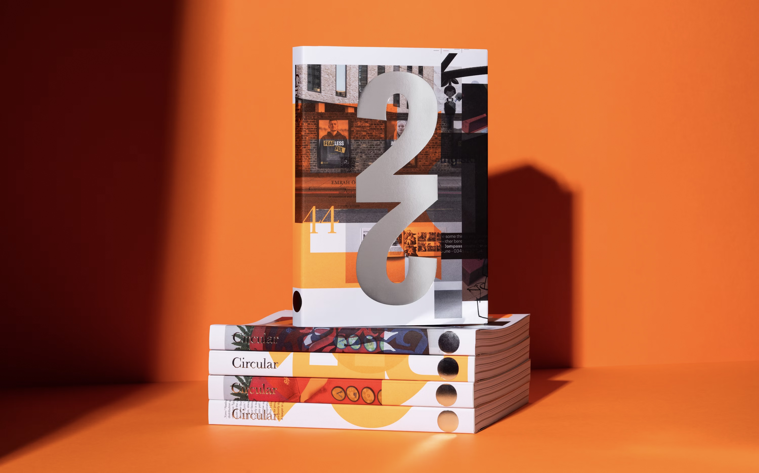
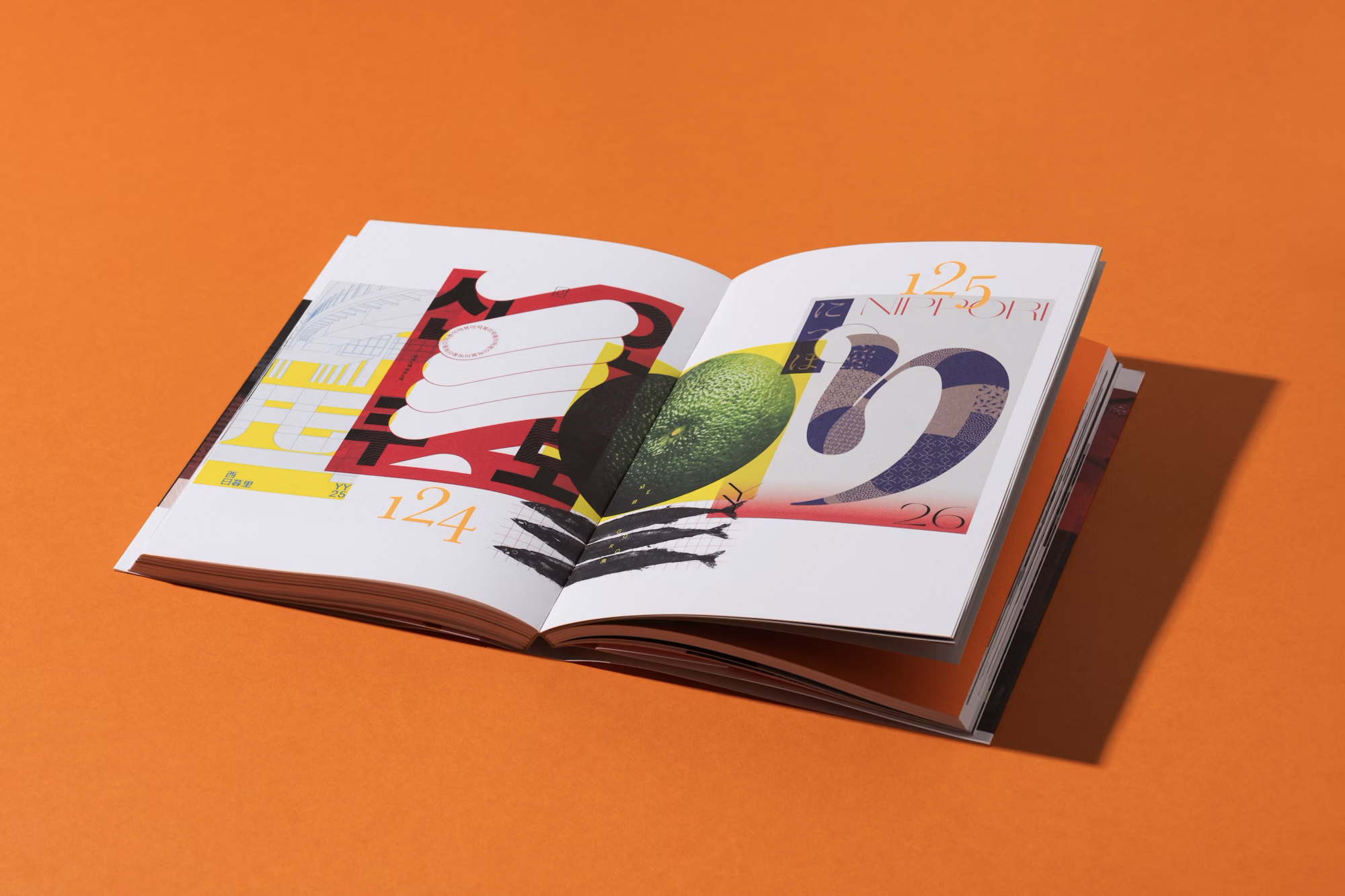
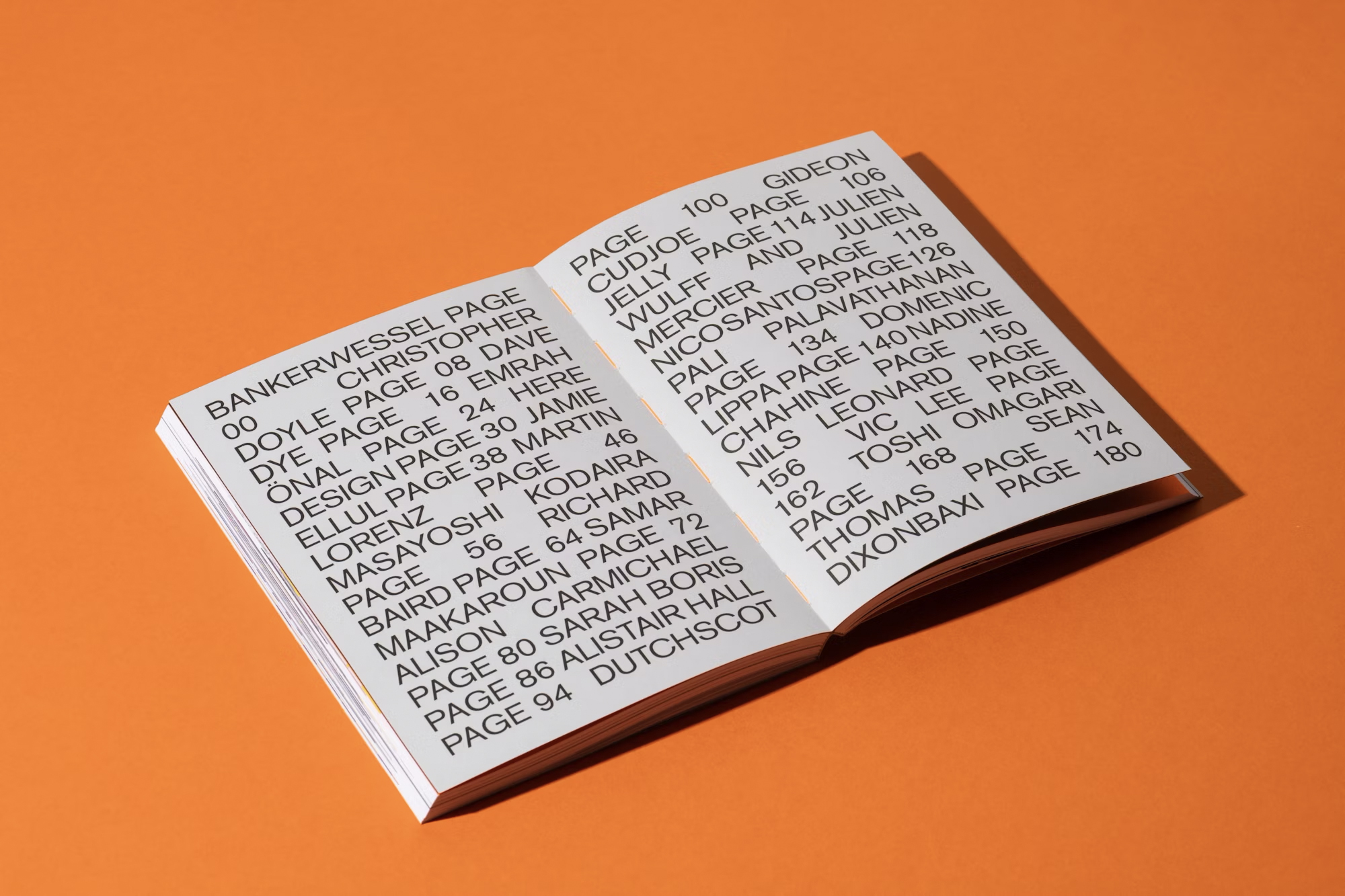
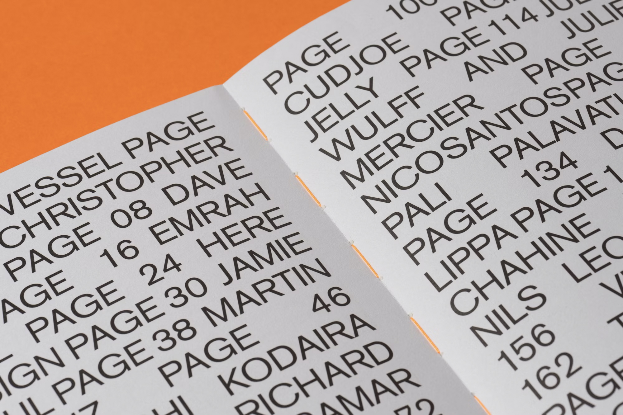
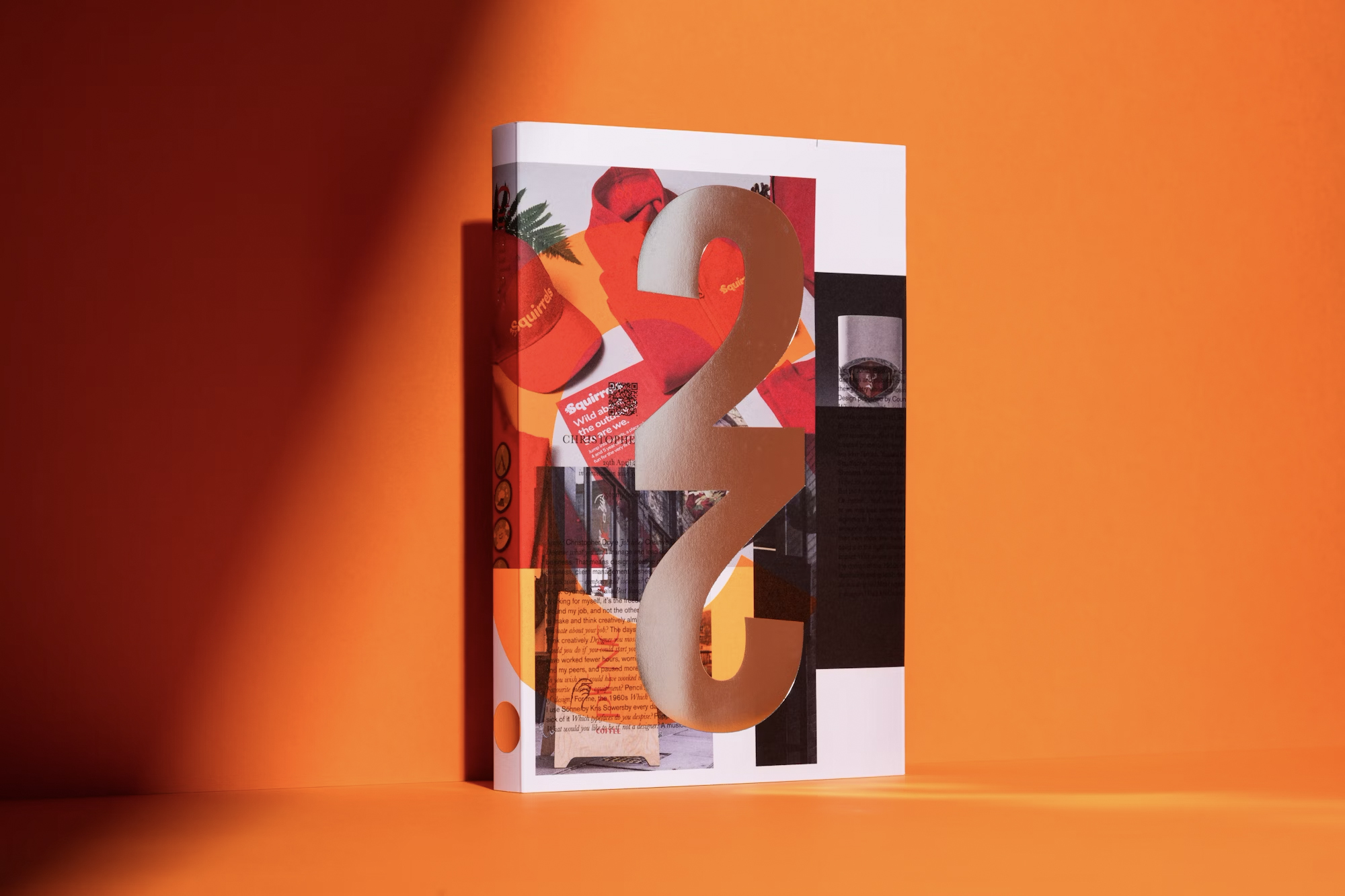
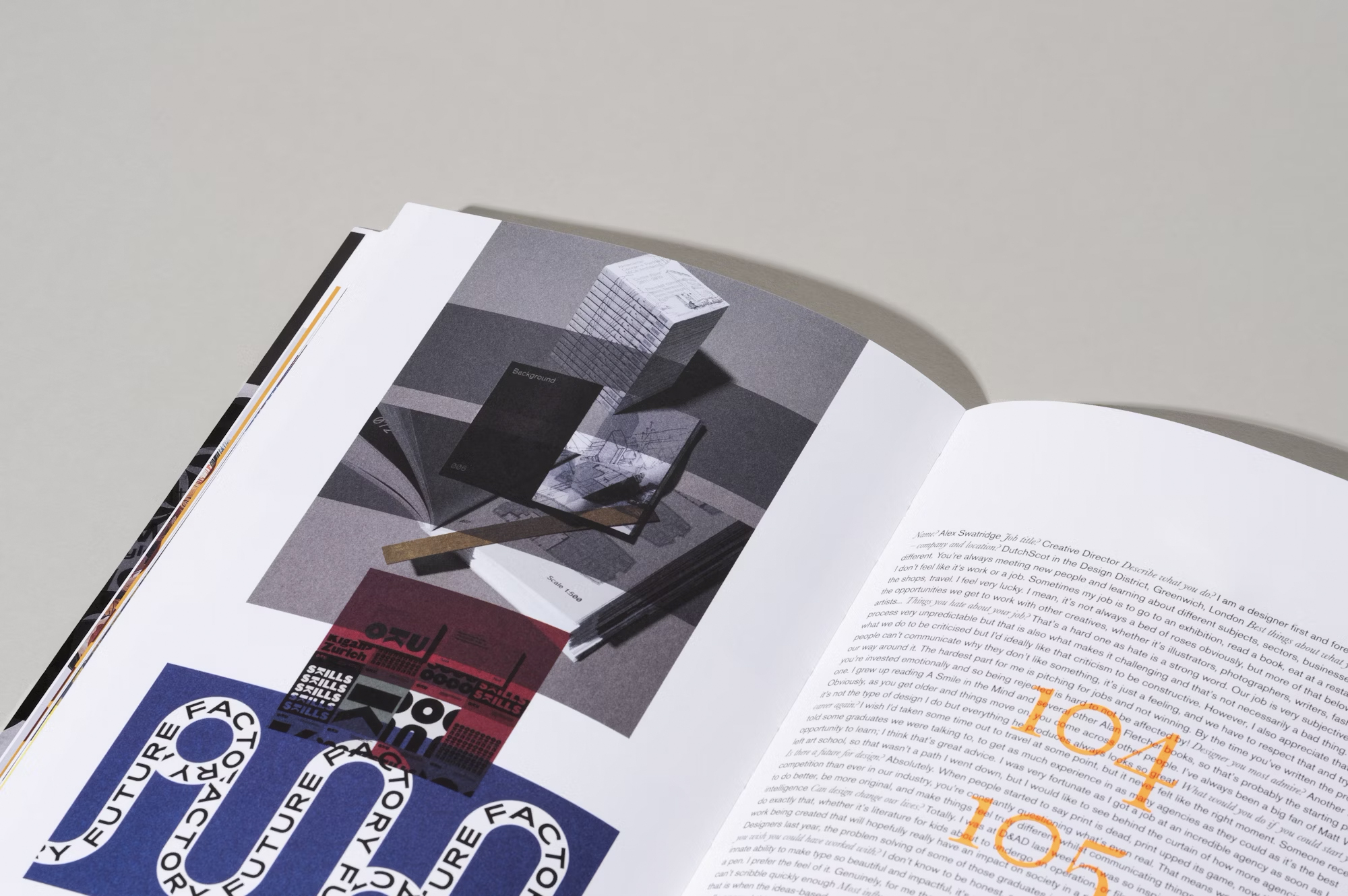
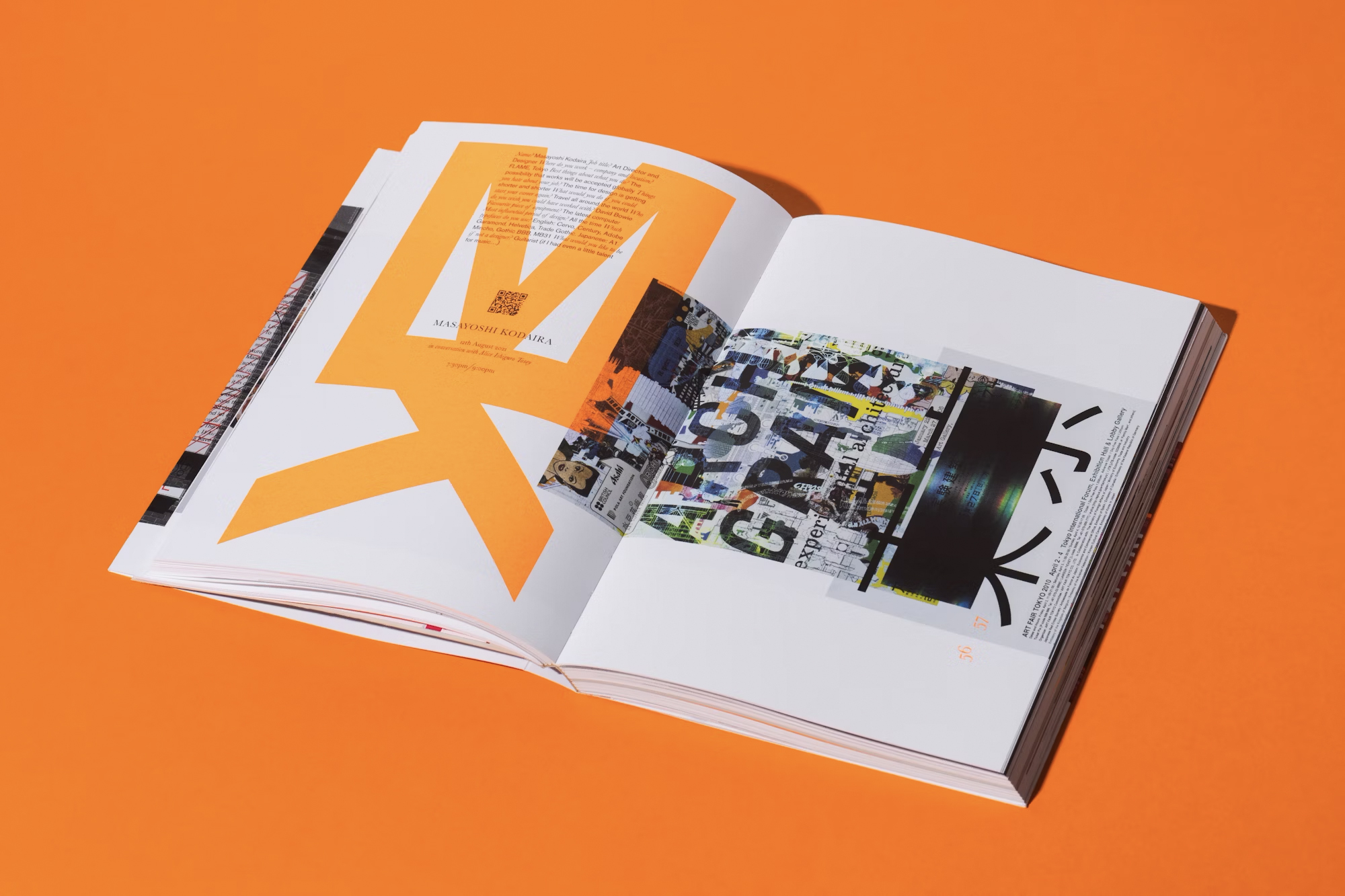
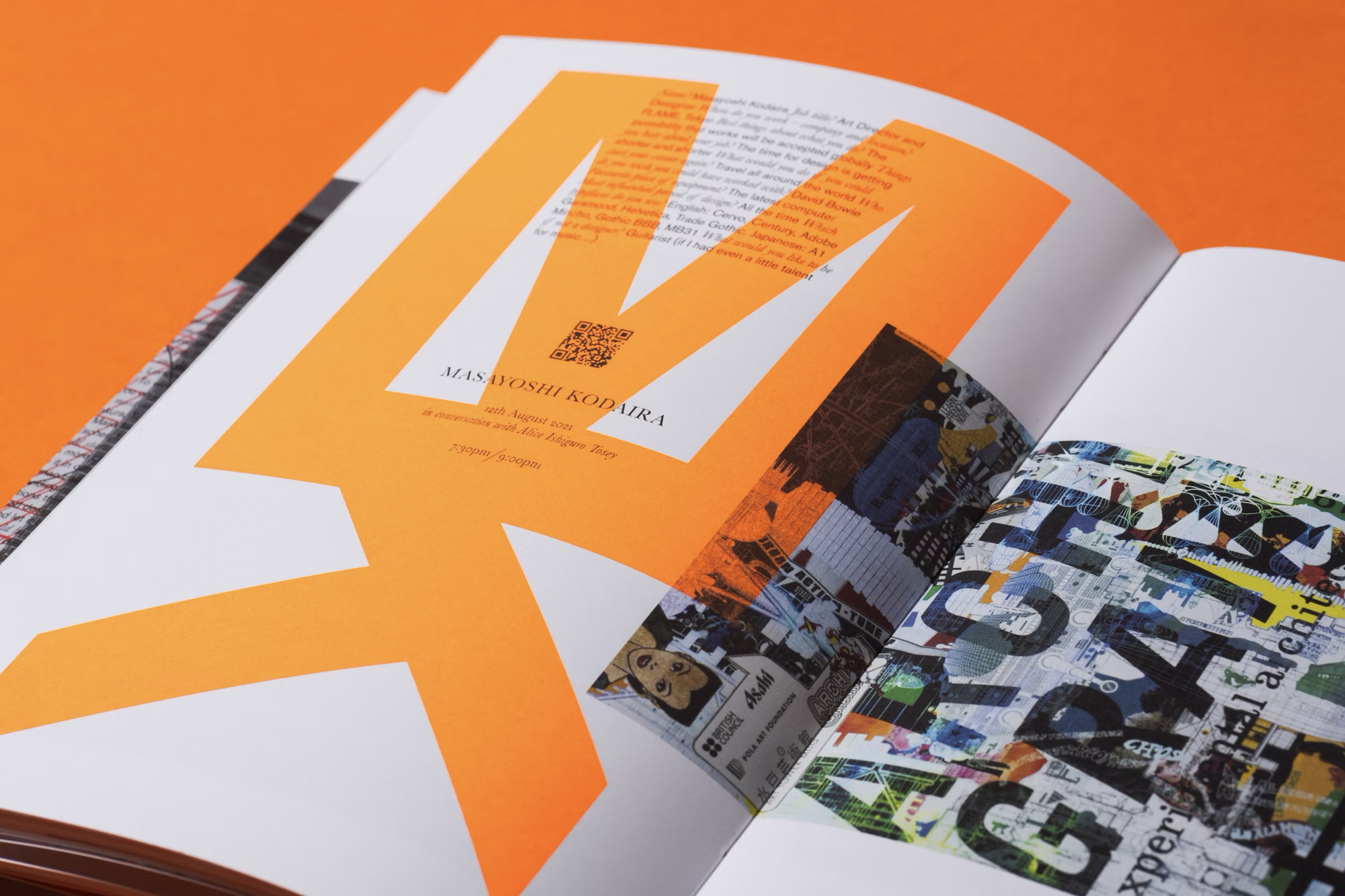
What stands out in this issue is its use of imagery and typography. The design process focused on balancing dualities, using typefaces like Akzidenz-Grotesk and Baskerville to create tension within the layout. The final design is layered with complexity, allowing for the content to stand out in a visually engaging manner.
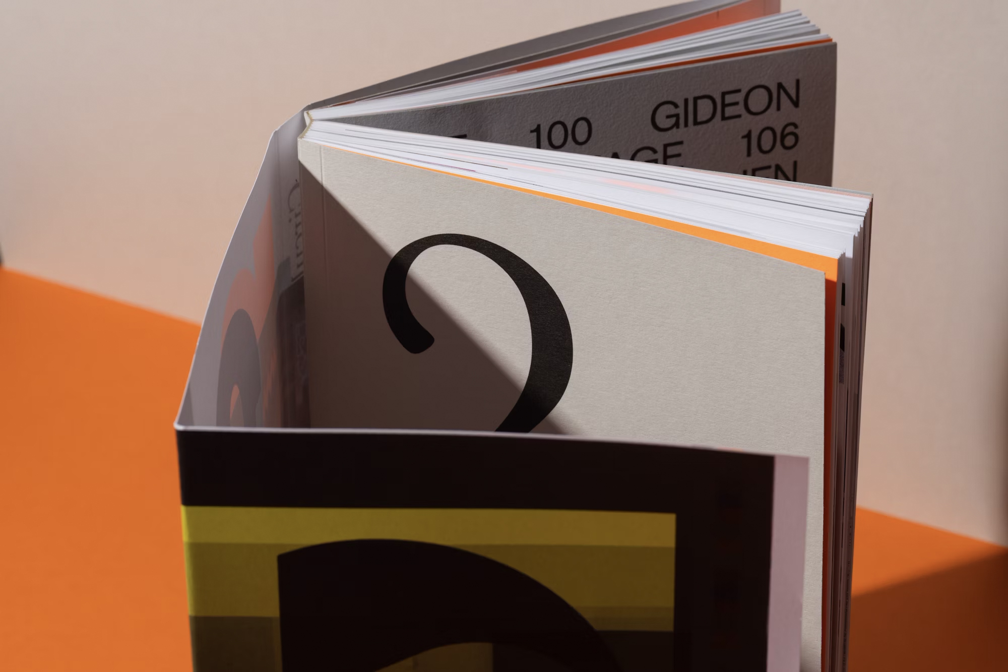
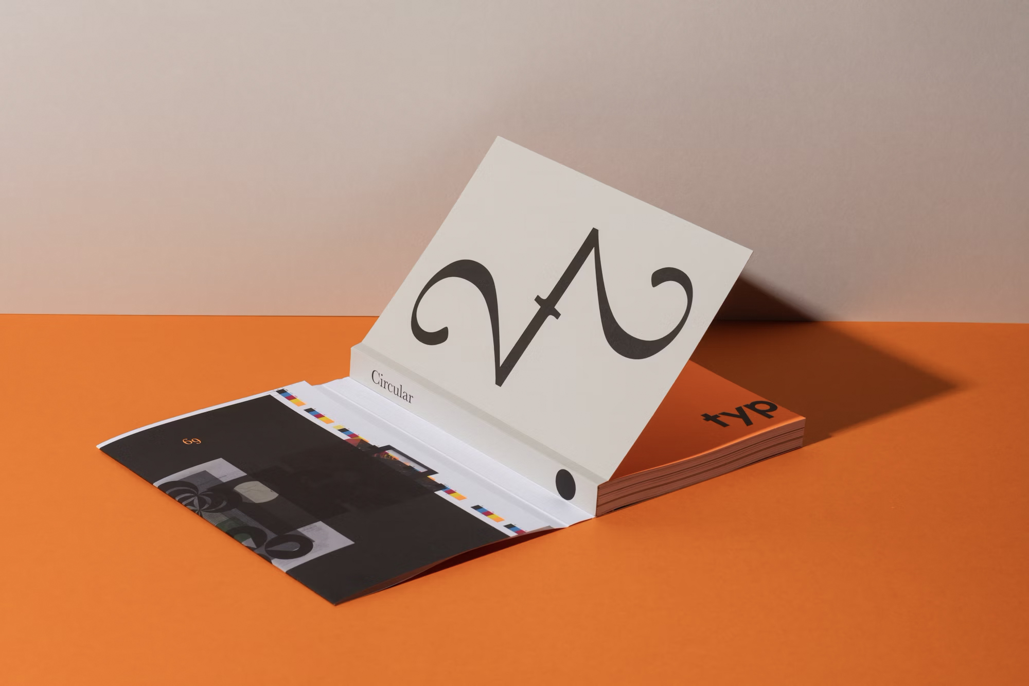
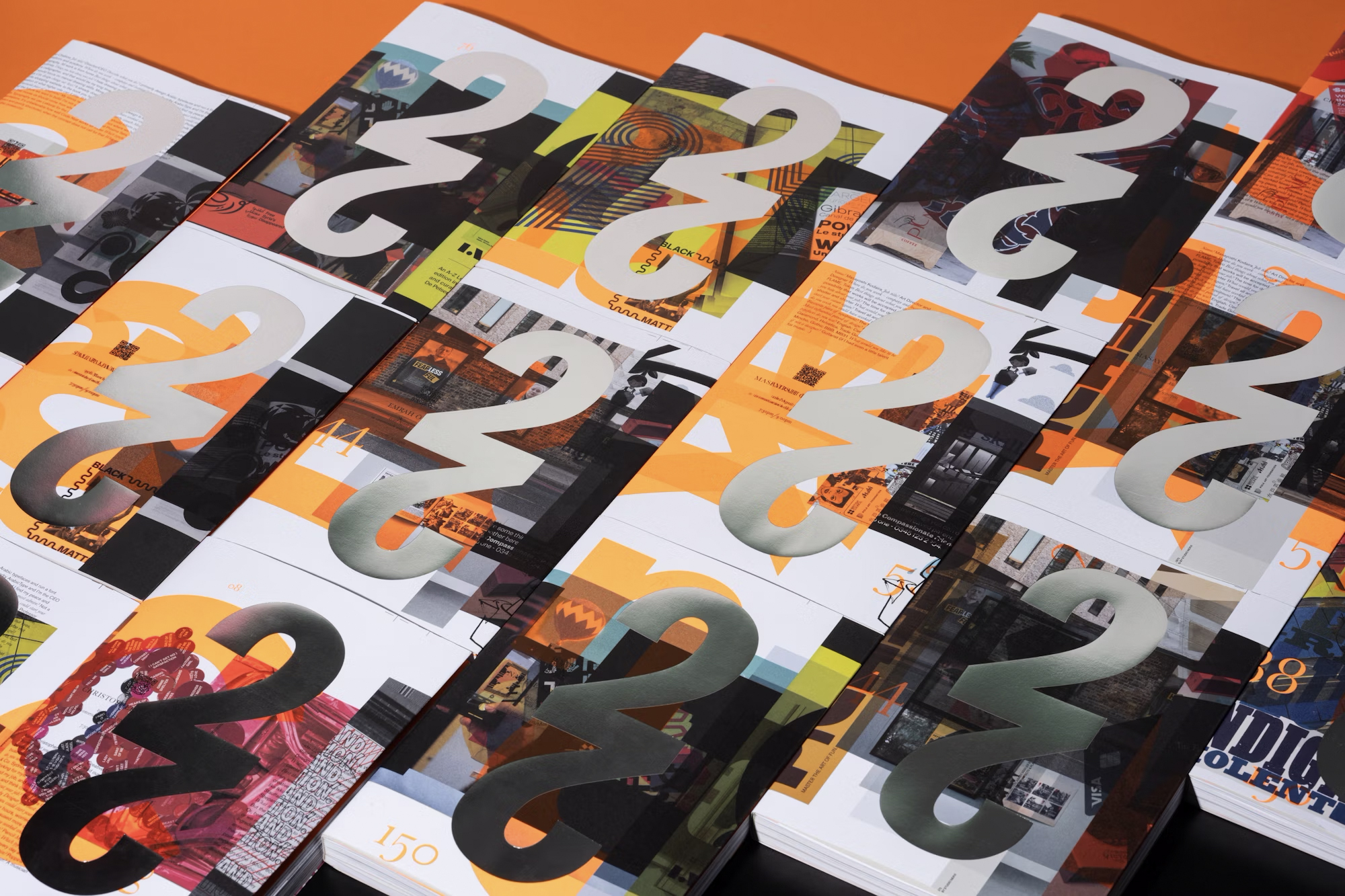
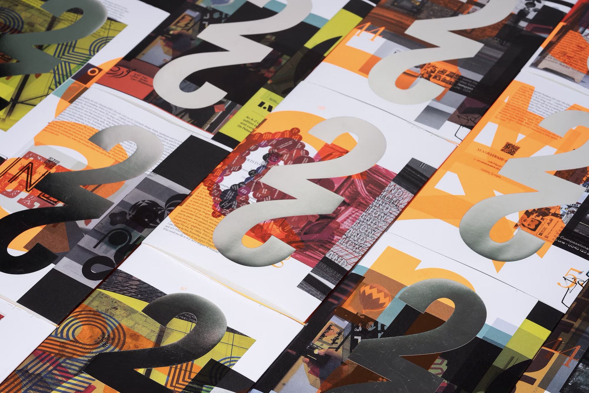
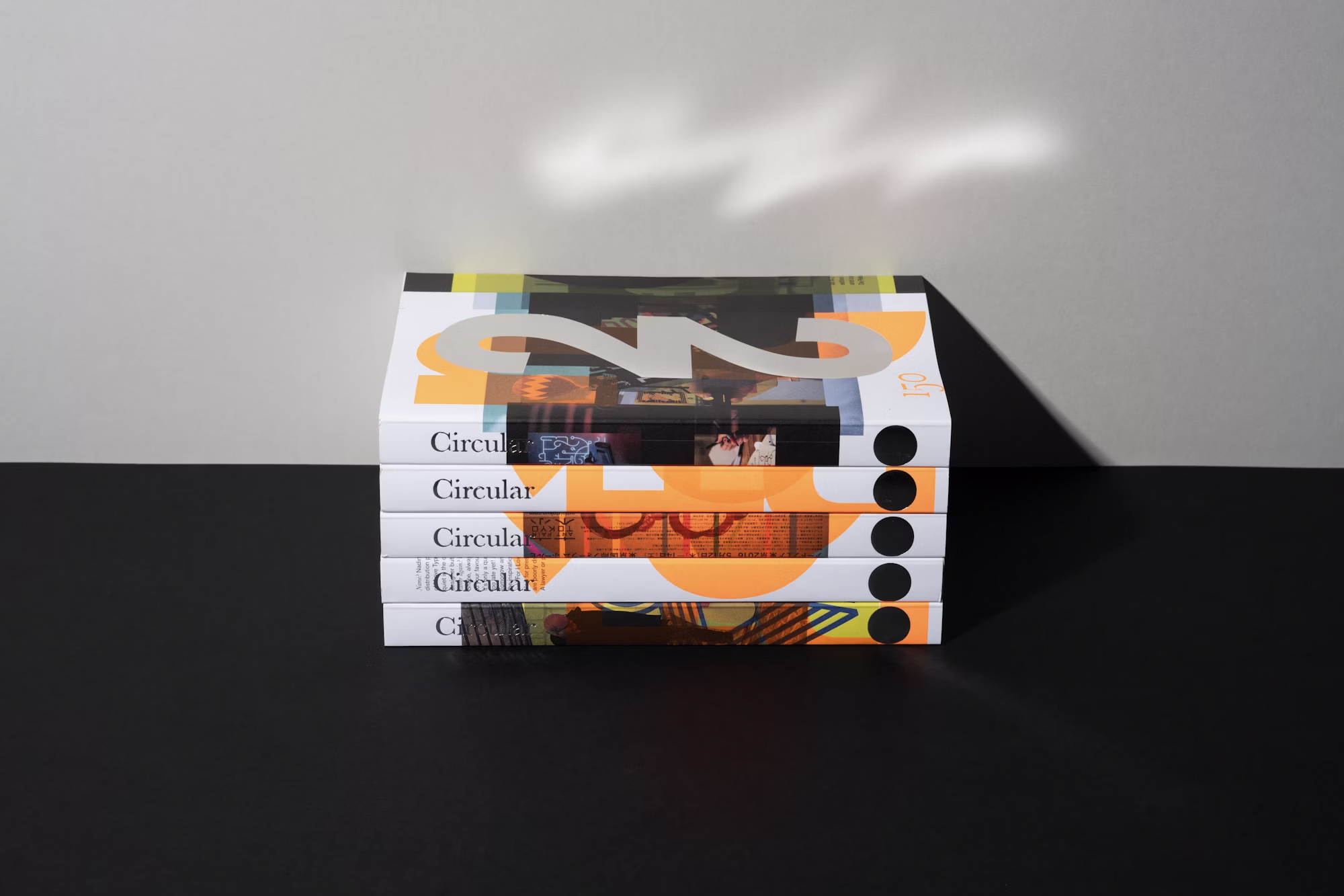
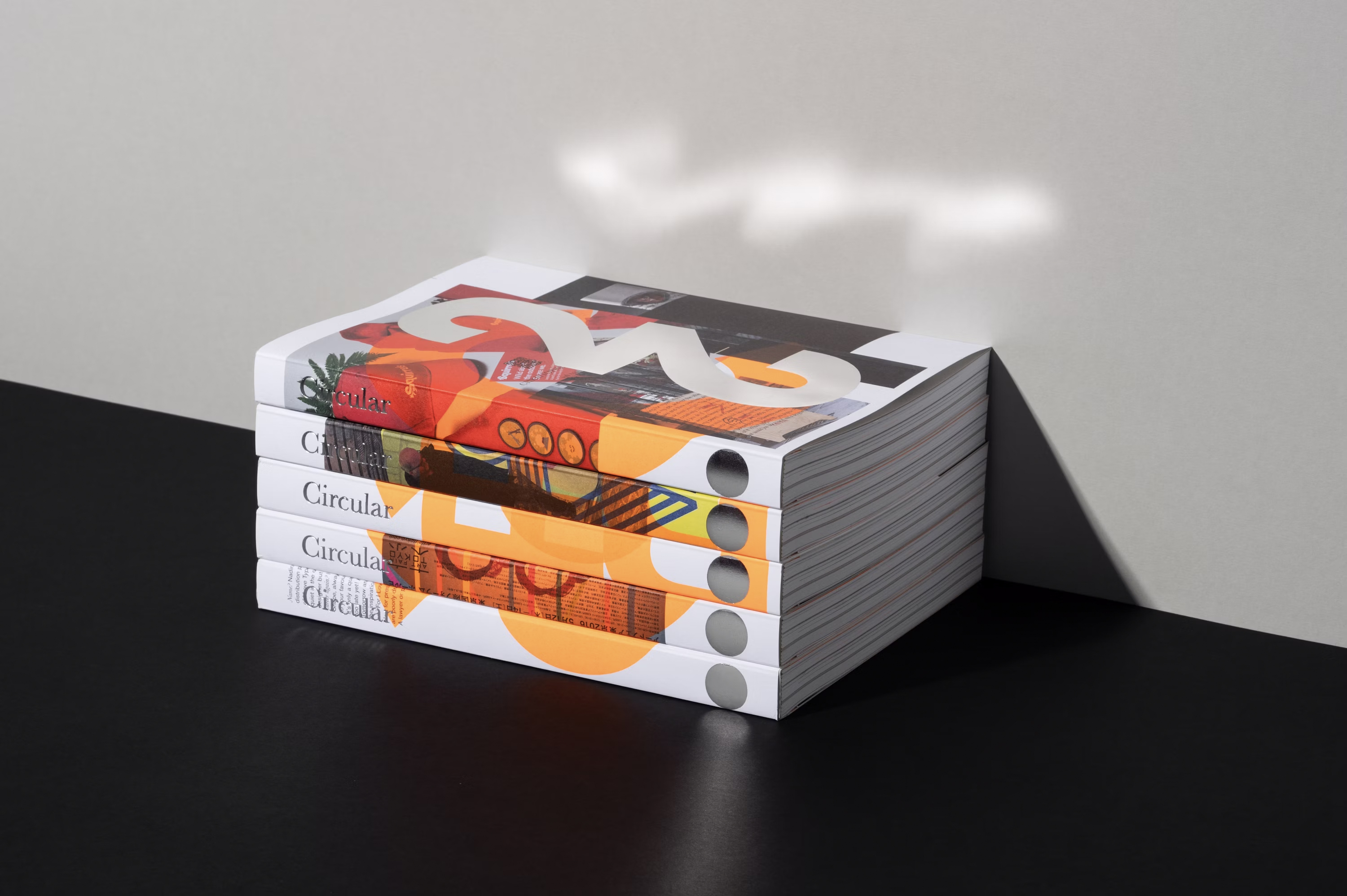
A key feature of the design is the incorporation of fluorescent orange accents and overlaid images, creating a tactile and immersive experience for readers. The 14 randomly designed dust jackets, made by overprinting different running sheets, give each copy of Circular 22 a unique feel. This experimental approach was a celebration of the print process itself, fully embracing randomness and surprise.
The collaboration between Lippa and Sutherland, coupled with the expert craftsmanship of printer Richard Davey from Empress Litho and G.F. Smith, resulted in a highly original magazine that breaks away from traditional design conventions. By positioning the introduction and colophon two-thirds into the magazine instead of at the front or back, the design invites readers into a different kind of editorial experience—one that is as much about the process of design as it is about the content.
Tags:
Circular 22, Pentagram, Typographic Circle, editorial design, typography, design innovation, creative print design, design experimentation, graphic design, Akzidenz-Grotesk, Baskerville, design collaboration, overprinting, graphic arts, printed publications, print culture, modern typography, editorial layout, design playfulness, tactile experience, magazine redesign, experimental design, design process, contemporary print, design craftsmanship, visual storytelling, print production


